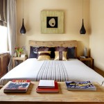
How you feel as you walk into a room depends on the style and color scheme of interior decoration. Some interior designs use so many loud colors and gaudy decorations that it generates a repulsive feeling amongst those who prefer more sober and cool colors to make them feel comfortable. It happens because when you walk into any space, your eye has some ways of translating the colors and color combination. It affects how you interpret the style and mood that influences your comfort level. To create the desired effects, any interior designer makes thoughtful efforts to precisely appeal to the senses of people with colors and generate the desired effect.
Colors create the mood and make people get a feel of the space in a certain way. That, in turn, influences the choice of furniture, flooring, and lighting, and this is the basic principle of interior design Singapore. The color theory provides the foundation on which interior designers create a well-planned space by using appropriate colors to produce the desired effects. Different people react to colors differently, and designers use colors to give a distinctive look to the spaces that encompass a particular style and evoke the desired mood.
Use of color theory in interior design
For the common man, it might not be easy to understand the thought process of interior designers behind choosing color schemes. Interior designers use the color theory consciously that provides a foundation to achieve their goals. Just as one would not start construction of a building without proper plans and drawings, similarly there must be careful planning about using colors in spaces to create the desired visual effects that create the mood of the space. Good understanding of color theories and effects provide confidence to interior designers in using colors the right way.
The basis of choosing colors
Choosing colors for interior spaces is not easy, and one must have a good understanding of symbolism and color psychology that dictates the choice of colors to serve a different purpose. However, there are three key questions to ask before proceeding in color selection.
Manner of use of space – Determining the purpose of using the space or the way of its use is fundamental to choosing colors. The colors used in residential settings will be quite different from those used in commercial spaces. Personalization is essential when selecting colors for use in residential spaces, but the colors used in hospitals are generally white and blue that depicts calmness and creates a relaxed ambiance. On the other hand, trendy, bright colors would be appropriate for restaurants and fast food joints.
Who are the users – Besides ascertaining the use of space, which the end-user of the space is also a prime consideration. Whether youth, adults, or children use the space and their behavior and attitudes influence the selection of colors. Bright colors attract children and infants have a strong attraction for red and blue. Elders and adults tend to have a lower visual resolution that makes colors appear dimmer, and besides using bright colors, designers must also ensure high contrast.
Consider the climate – The location or more precisely it’s climate influences the choice of colors. Color schemes for spaces located in a bright and hot climate will be quite different from the colors chosen for cold climates with dull weather. Social and cultural settings also impact color selection.
Color combinations
A color wheel is a tool that helps to understand color combinations in the right perspective and how the human brain processes these combinations. The color wheel invented by Sir Isaac Newton and later developed by scientists and artist helps to define how humans interact with colors. Color theory is the science behind the way humans perceive colors and respond to specific color combinations and proportions.
Although there are a variety of color combinations, there are three broad categories of colors – primary colors, secondary colors, tertiary colors, and complementary colors.
Primary colors
There are three primary colors which cannot be created by mixing any two other colors. All the color combinations that appear on the color wheel are the result of combining the primary colors, which is why these are the building blocks of any color that we see. Red, yellow, and blue are the primary colors which when used in varied combination can produce some other color.
Secondary colors
Secondary colors are products obtained by mixing primary colors. Orange, green, and purple are secondary colors.
Tertiary colors
Some say that tertiary colors are the product of mixing a secondary and a primary color. Some others say that you can obtain a tertiary color by missing two primary colors in the ratio of 2:1.
Complementary colors
To create black or muddy brown hue, artists and designers use the combination of red and green, purple and yellow and blue and orange.
Good understanding of colors helps to leverage its powers to create stunningly beautiful interiors.