Color choice is a major subject when it comes to the interior design of our homes. Choosing the right color combinations in a house can be a little bit of a task, but you should always go for the choice that feels right for you. However, most of us tend to make the paint color as the first choice, and this can make it a little tricky to match the other components like furniture and carpets in the house. If you are not sure of your color choice, you can start by drawing a simple plan of your apartment. Different color combinations will affect the mood of the house differently, and some of the factors to consider are as the following.
Consider the Lighting of your House
Color is mainly light reflection, and it is necessary to consider the amount of both natural lighting and the lamps in the house when choosing the color scheme of a room. A warm color combination is more effective in a room that receives less daylight since warm colors will soften the shadows and also reacts well to artificial light.
The color combination of your choice:
Monochrome
If you decide to go with the monochrome color selection, this is an easy task since the house has mainly one dominant color throughout. While this may seem somehow dull in the long run, you can add different tones and patterns on the color to keep it more interesting. You can get the right tips and ideas on the different colors and patterns at housetipster.com.
Commit to Color
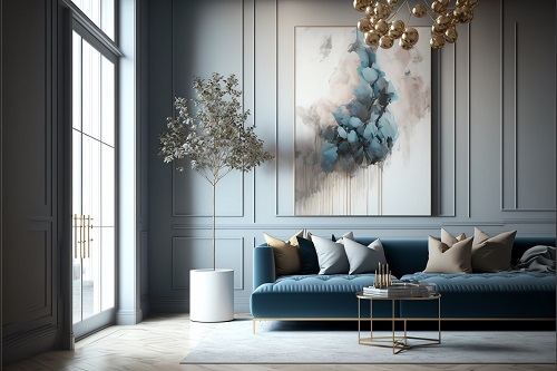
There are many ways of adding colors in different patterns and small touches, and this can completely change the interior looks of the house. The textiles and fabrics in the house are the perfect elements to use in creating the patterns and adding texture. Adding artworks also helps in bringing out colors in the house and your personality as well. While keeping neutral might seem like a safe option, adding colors has great benefits in your home too. Colors aid in creating harmony between different furnitures in the house.
Use some Harmonious Colors
This is the point where the color wheel comes in handy. Harmonious colors are placed next to each other in the color wheel for example red and pink or blue and violet. Using similar colors can work great for you especially if you prefer bright colors. All you need to be aware of when choosing harmonious colors is which of the colors blend with each other well, and you can use the color wheel to make everything simpler for you.
Complimentary Color Schemes
Complimentary color schemes simply imply to using opposite colors that compliment each other. Complimentary colors create great dynamic color schemes and although they demand a lot of attention since you need to balance them all.
When making your color selection, it is best to go with your favorite colors. It is important to take into consideration the colors of the less replaceable items in the house before deciding what paint to use for your walls since paint is much cheaper than other household items in the house and you can always repaint.