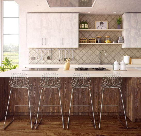
Are you struggling to make your house feel like a home? Whether you’ve lived in your place for years of you’ve just moved in, sometimes it’s not easy to create a space that feels like it belong to you alone. Sometimes you need some interior design inspiration. What better place to spark your inspiration than looking to the great outdoors? Bring your favorite outdoor colors and designs into your own home.
This guide will introduce you to the best colors in nature to consider for 2019. These aren’t just colors that you’ll love today. You’ll love from for years to come. Here’s your guide to inspiration that comes from the great outdoors and beyond.
1. Sea Green
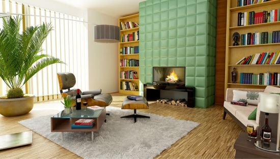
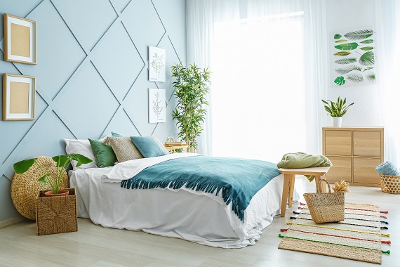
Taking inspiration from the sea leaves a lot of room for exploration. While most home designers go with the obvious (shades of blue and white), you can push the boundaries of this seaside relaxation with sea foam green. This is the perfect balance between both blue and green, and it’s guaranteed to make your room relaxing and sharp at the same time.
The best way to make the most of this color is to balance with shades of white and coral. White will help this color come alive by creating the ambience of the ocean’s waves, while the coral will remind you of what lies beneath the surface. Use a matte finish to keep it from staining easily.
2. Honeycomb
Rich golden yellow is all the rage this season. We’ve seen it in fashion and now it’s taking over the home design industry. This shade of yellow is best used as an accent. Add it to a door for a pop of color or make a statement by painting your kitchen cabinets in this fun shade. For more cabinet inspiration, check out https://www.bestonlinecabinets.com.
Honeycomb is here to stay, and that’s something to celebrate. Show your mastery of interior design by being bold with this color. It’s the perfect way to add some light and positive energy to your home without going overboard.
3. Woodsy Gray
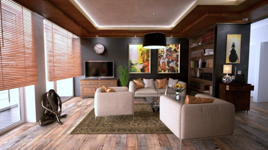
While gray might not seem like a color that evokes the mystery of the woods, when paired with the right accents it does just that. Darker shades of gray will make your space look warmer and cozier, just what you want for the winter season. If you’re not sure you can go that dark, tone things down with a lighter gray and some dark accents. It might sound crazy, but it might just work for your space.
4. Poppy Violet
Another color trend that seems to be everywhere in 2018 is violet. This was the 2018 Pantone color of the year, and it’s easy to see why. It’s not only a fun choice, but it looks lovely in just about any room. Bring the excitement of a field of flowers into your home by opting for this color as an accent shade. Violet also looks fabulous when used outside, so don’t feel like it’s limited to your indoor spaces.
5. Cavern Clay
Finally, the last color to experiment with in 2018 is cavern clay. This color is like a flashback from the 1970s, and we’re glad to see it making a comeback. Clay is a red-brown that delivers on warmth. Even if you don’t think you can pull this shade off, you probably can.
The best tips for integrating clay into your color scheme is to stick with what you know. It functions as a neutral when you choose a shade with enough brown undertones. Pair this orange with navy or a turquoise to make sure it really shines.
Color is a great way to add personality to your home. Why not bring your favorite parts of nature inside as inspiration? Follow these color ideas above for a home that shines in 2018 and beyond.

