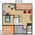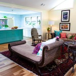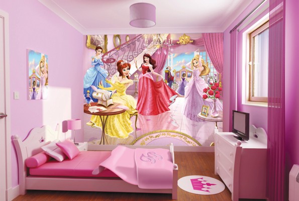
Coloring spaces or dressing interiors with life and brightness is something which always gives a special kind of happiness to me. Being a designer it’s like filling in breath of life with colors to the interiors and it becomes more special and sweet when spaces glow up with monochromatic color scheme/theme. Too old yet always new, different but a unique blends of theme which always give interiors a balanced, well harmonized and smooth look. Monochromatic theme is the perfect use of tints and shades of the same hue/ color to charm a space with the feeling of being united always.
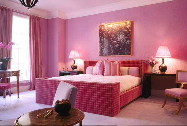
This color scheme gives the feeling of simplicity, elegance, and cleanliness to the respective space (formal or informal). All Monochromatic colors go well together, making this scheme easy to manage, and producing a soothing and calming effects all over and mixes up well with the overall decors as well. The monochromatic scheme is very easy on the eyes, especially with blue or green hues. The selected color can be integrated with neutral colors such as black, white, or an in-between gray. When using Monochromatic colors or theme for any particular area, keep in mind that it does not work to depict or emphasize a particular element within the composition. The reason for that is the lack of color contrast as we have to just play with the limited shades and tints of the same hue.
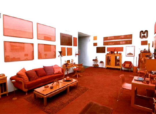
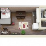
The number one advantage of using monochromatic colors is that it always looks visually appealing and balanced. Different that of a texture art, striped walls, and wall papers etc.it has its own quality to bring out impressive interior’s forever for every kind of space. Monochromatic design has been around in the interior design field for years, and has continued to grow in popularity. It’s one of the theme which easily gets mixed up with any kind of furniture, décor setting, accessory placement, ceiling design etc. The number one advantage of using monochromatic colors is that it always looks visually appealing, melodious, well harmonized and balanced. On the other hand, its chief disadvantage is that it lacks vibrancy and energy as there is no other color combination to tease or cheer up the present theme.
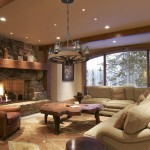
It’s the simplest and the most appealing color theme for any kind of interior space. Its suitability match’s up easily with any formal or informal space requirement, age, occupants and other factors like general requirements and designing concepts as well. This theme supports every kind of illumination effects and helps up escorting more of glowing interiors then giving a bad impression of dull and dark interiors. This color theme can also be pulled the design and décor of furniture and other accessories. Furniture can too speak the same language as the theme to get well connected to the design pattern and color theme of the interiors.
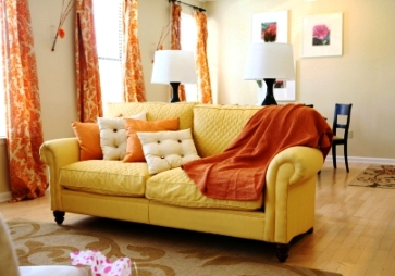
Come out of texture effects, 3D illusions, wallpaper pasting etc. and let your interiors capture the beauty of simplicity and balanced visual diet. Most amazing monochromatic effects charm up with hues of yellow, green, red, purple etc. at residential designing and for a formal touch hues of blue, cream, yellow orange etc. works out perfectly. Make your spaces most elegant, impressive and amazing without mixing up and playing up with too many colors, patterns and art style. Unite the elements of color into the threads of monochromatic theme to get one of the best interiors above all.